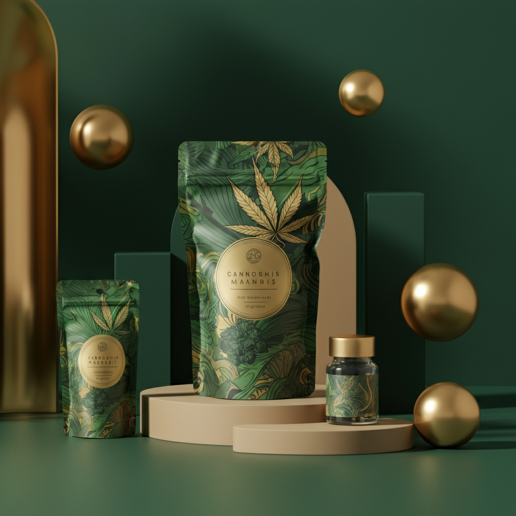
Your cannabis packaging is more than just a container—it’s your brand’s first impression. In dispensaries brimming with options, products that reflect their brand’s unique identity through thoughtful design stand out from the crowd. Effective cannabis packaging does more than protect your product—it tells your story, builds trust, and forges lasting connections with your target audience.
The most successful cannabis brands recognize packaging as a vital marketing tool. When customers can instantly understand your brand’s values through visual elements alone, your packaging becomes a silent salesperson, working around the clock on dispensary shelves. Achieving this level of branding clarity, however, requires strategic planning and collaboration with the right weed packaging company.
Define Your Brand Identity First
Before diving into design, establish a clear and compelling brand identity. Are you a premium craft cultivator focused on artisanal quality? A trusted medical provider prioritizing wellness? Or perhaps an innovative recreational brand catering to adventurous consumers?
Every packaging decision should align with your brand’s personality. Luxury cannabis brands, for instance, may opt for minimalist designs with upscale materials like embossed textures or metallic finishes. In contrast, brands targeting younger, recreational users might lean toward vibrant colors, fun typography, and bold graphics that pop on a crowded shelf.
Document your brand values, target audience, and unique selling points before approaching a packaging design team. A clear foundation streamlines communication, saves time, and avoids costly revisions down the road.
Leverage Color Psychology to Connect Emotionally
Colors evoke emotions faster than words and are key to communicating your brand message. While green is a natural choice for cannabis packaging, don’t limit yourself to the obvious. Purple exudes sophistication and luxury, while shades of orange or yellow spark energy and creativity.
Choose colors that align with your product category and brand positioning. For instance, calming blues and whites are ideal for CBD wellness products, while bold colors like red or bright green signal the potency of high-THC recreational items.
An experienced packaging partner will have expertise in color reproduction across different materials. What looks perfect on a screen can appear drastically different on physical surfaces, so always request prototypes before finalizing your design.
Use Typography to Reflect Your Brand Voice
Typography plays a significant role in shaping how customers perceive your brand. Clean, modern sans-serif fonts convey professionalism and reliability, making them ideal for medical cannabis brands. Script fonts can highlight luxury and craftmanship, while bold, geometric fonts appeal to trend-savvy younger audiences.
Make sure text remains legible across all sizes, especially for compliance information. A great packaging design balances creativity with regulatory requirements, letting your brand voice shine while adhering to legal standards.
Choose Materials That Speak to Your Values
The materials you choose for your packaging send a strong message about your brand’s priorities. As eco-conscious consumers become more prevalent, sustainable options like recycled or biodegradable materials are increasingly appealing.
Glass containers, for example, signify premium quality and superior product preservation, while child-resistant plastics may be more practical for budget-conscious or family-oriented consumers. Some companies now even offer hemp-based packaging, aligning materials with the cannabis industry’s eco-friendly ethos.
Think about how materials influence the customer experience. Are your customers drawn to the heft and premium feel of glass? Or do they prefer lightweight, portable alternatives?
Keep Consistency Across Your Product Line
Strong cannabis brands maintain a consistent visual identity while allowing flexibility for different product types. Your packaging design should feature unifying elements—such as matching color palettes, typography, logo placement, or graphic motifs—so customers instantly recognize your brand across flower, edibles, or concentrates.
Experienced packaging designers can develop templates and guidelines to ensure visual consistency while accommodating regulatory requirements and product-specific needs.
Test and Refine Before Full Production
Before committing to large production runs, test your packaging with real customers. Use focus groups, surveys, or dispensary feedback to gauge how well your design resonates with your target audience.
Many successful brands refine their designs based on market insights. Your packaging doesn’t have to be perfect right away—it just needs to communicate your brand effectively and connect with customers. Iteration allows your packaging to evolve with your brand and changing market trends.
Final Thoughts
Designing cannabis packaging that authentically reflects your brand’s personality requires thoughtful planning, creative execution, and an understanding of your audience and market position. The right weed packaging company serves as a strategic collaborator, turning your vision into designs that not only comply with regulations but also drive sales and build loyalty. Great packaging is an investment in your brand’s future—when customers can instantly identify and connect with your brand through your packaging, you’ve created a powerful, ever-present marketing tool.